Faster documentation check.
A Strategic Redesign of the MyAccount Shopper Platform
Transforming a legacy shopper portal into a streamlined self-service hub that reduces support overhead and empowers global users.
Role
Senior UX/UI Designer
Industry
Fintech / E-commerce Payments
Duration
3 months
Overview
MyAccount is the central hub for millions of global shoppers managing subscriptions and payments processed via 2Checkout. The platform suffered from significant "post-purchase friction": users struggled to log in, update payment methods, or manage renewals, leading to a surge in expensive customer support tickets and high subscription churn.
My Role: As Senior UX Designer, I took ownership of the redesign project and led the process of deep data discovery and stakeholder alignment to the delivery of a scalable, white-label design system.
A platform users didn’t know they had — and couldn’t access when they needed it.
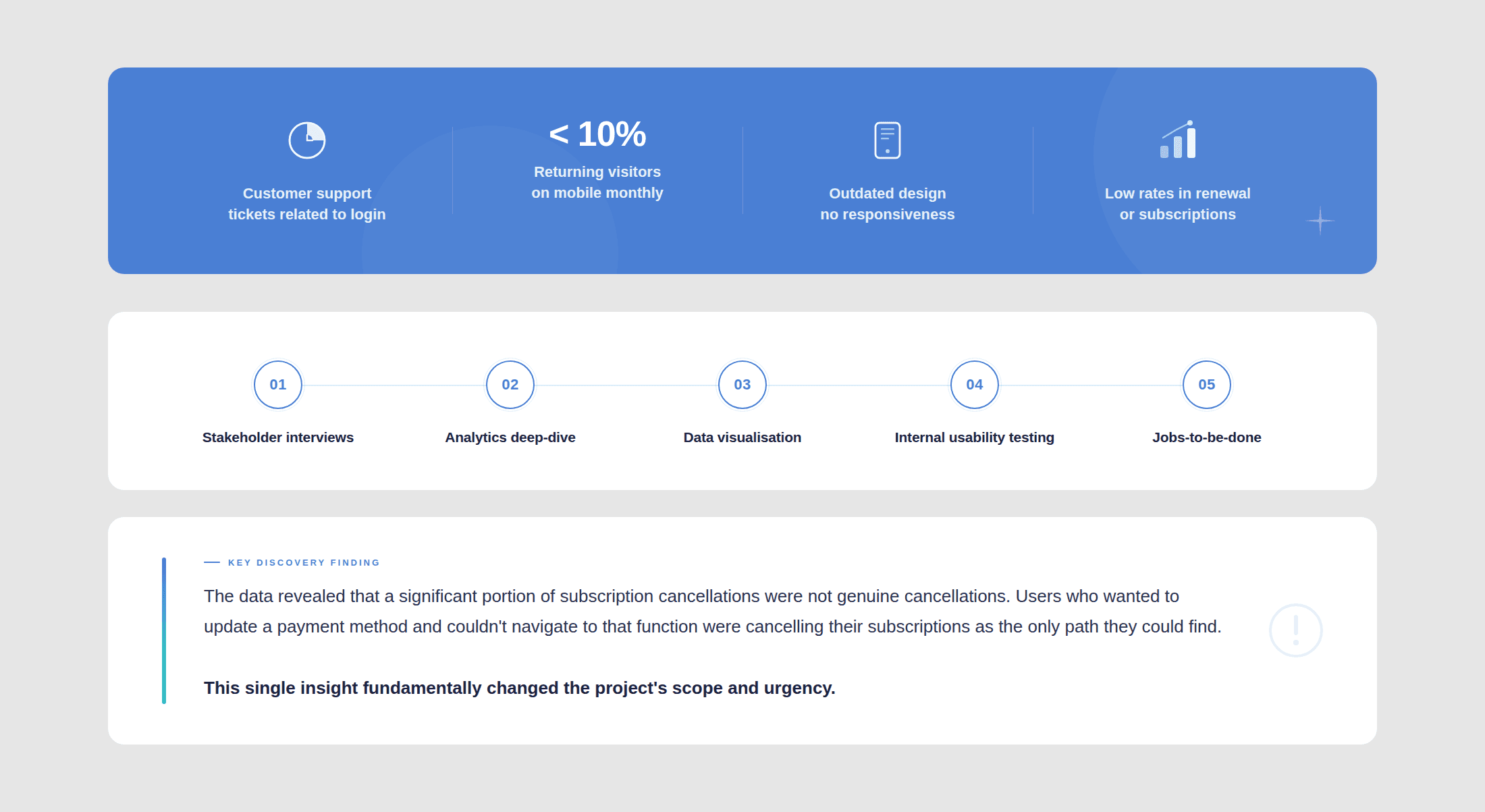
Access Barriers: High failure rates in login and account recovery flows led to a surge in expensive support tickets.
Mobile Neglect: With <5% mobile return rates, the platform was essentially unusable for the modern shopper.
Retention Leak: Users unable to easily update credit cards often chose to cancel subscriptions rather than navigate the complex UI.
Design Strategy
Defining success — and which metrics needed to be solved. I shifted the project from a "visual refresh" to a strategic overhaul. Success was defined by how effectively we could transition shoppers from "Support-seekers" to "Self-servers."
Primary Objective: Reduce friction in the "Golden Path" (Login > Update Payment > Renewal).
KPIs: Decrease support ticket volume, increase mobile engagement, and improve dunning management success.
Discovery
The project was aimed at a visual refresh when I joined it. I slowed that momentum for a while, as it was clear that we needed to uncover the underlying issues and discovery came first. I led a data-driven discovery phase to uncover why users were abandoning the platform. We moved through quantitative data, qualitative interviews, user testing and internal testing to map the pain points.


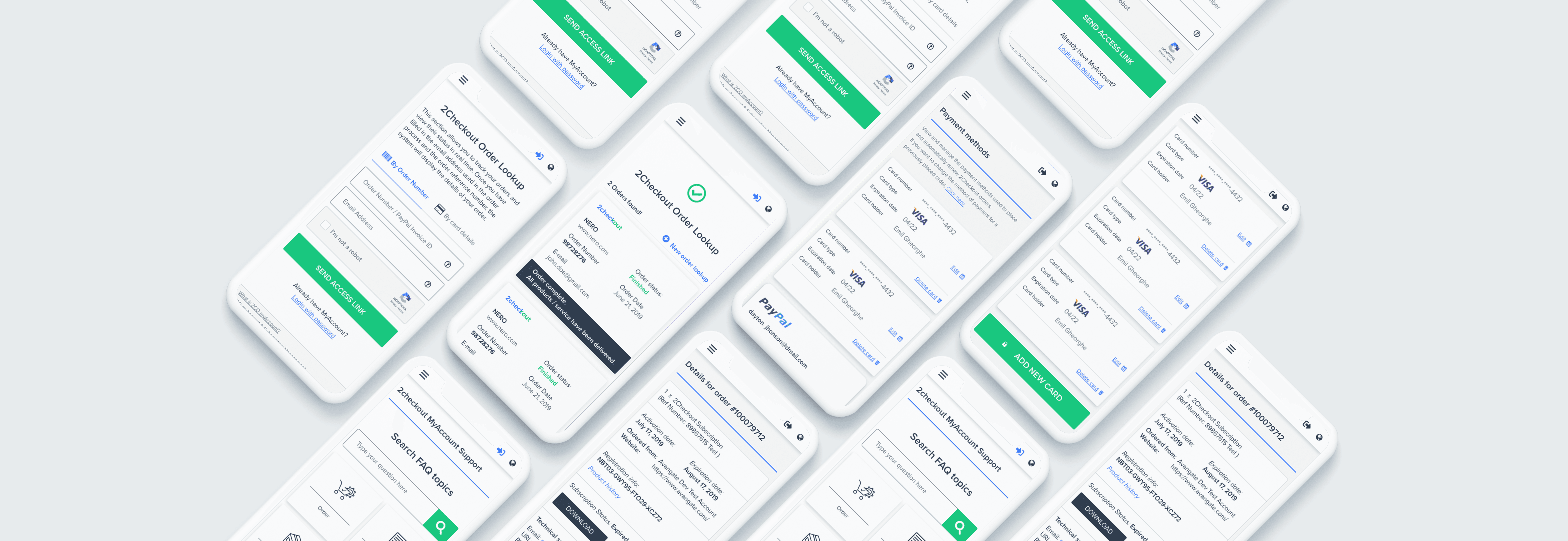
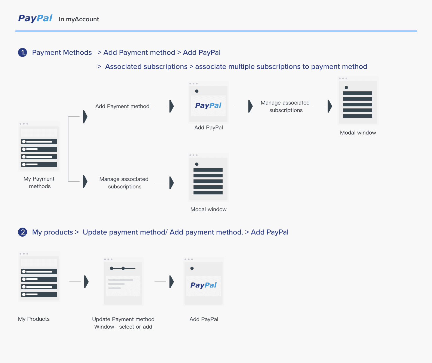
User Flows& Architecture
Redefining the architecture around what users actually needed to do was my main objective in this phase. After defining jobs-to-be-done, I systematically mapped every key flow, login, payment method management, subscription management. All documented diagrams as before/after making all the structural improvement visible and reviewable by the Product team.
Wireframes & Prototype
Focusing on functionality before aesthetics. I iterated through various low and high-fidelity prototypes for each flow to validate with the engineering team and stakeholders before moving into UI production.
A design language was built for neutrality and speed. I developed a library of UI components that were "brand-neutral." As a payment processor, the interface needed to coexist with thousands of different merchant brands without clashing.

User Testing
User testing was done with the same users as the Discovery Phase User Testing, as a method to to correctly asses the before/after changes with the same participants.
68% reported improved usability. 88% had completed successfully the proposed scenarios and the critical paths were fully validated.
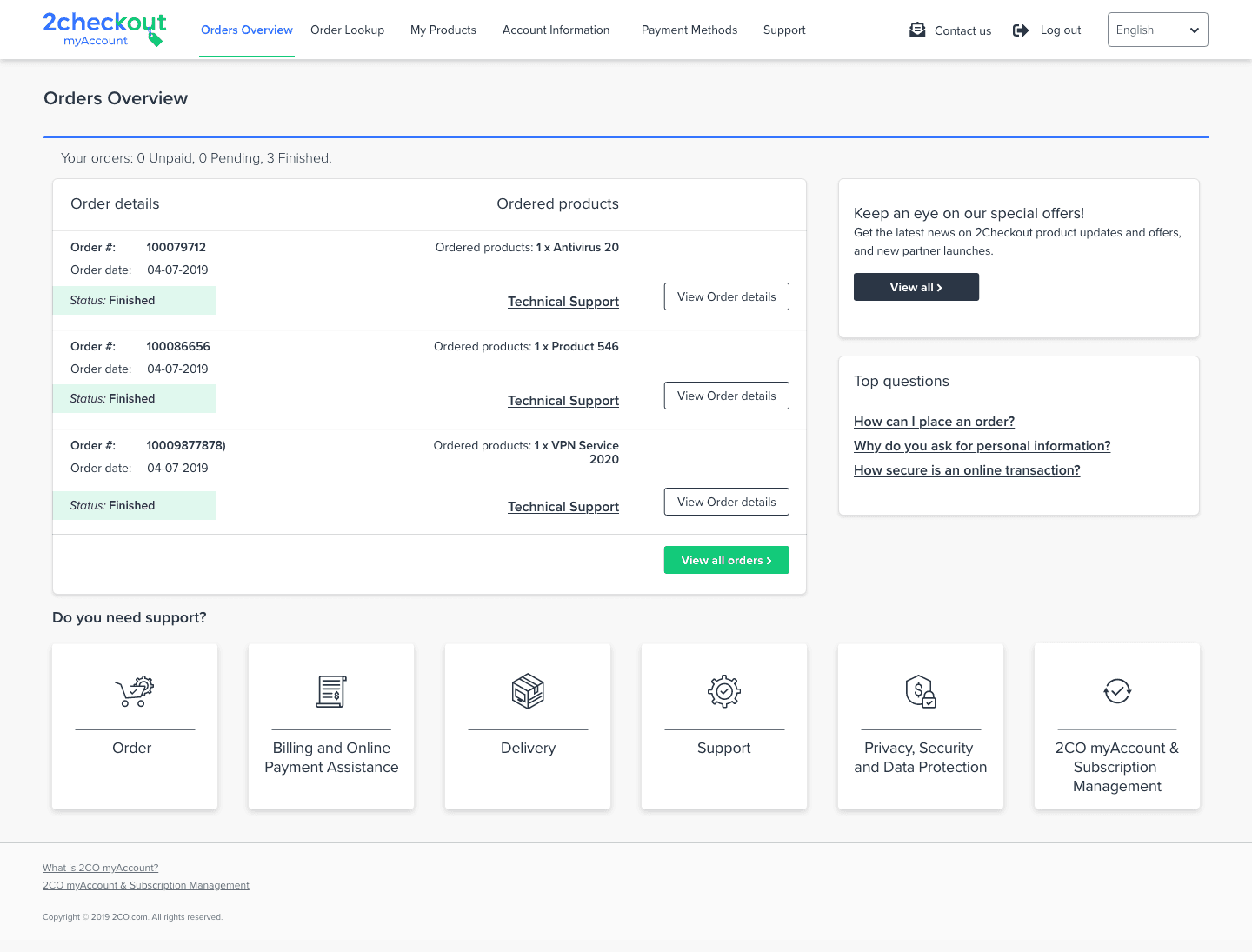
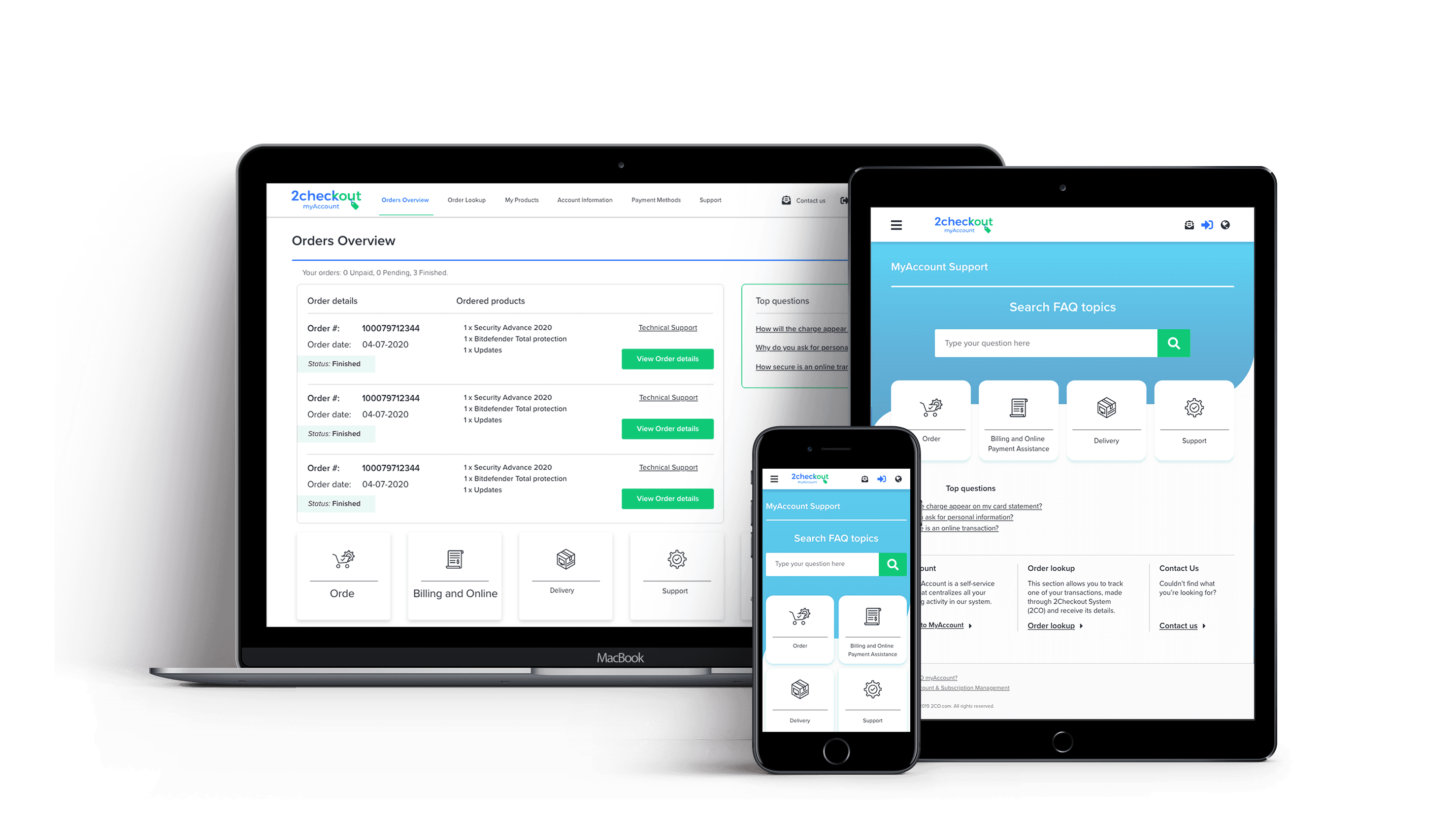
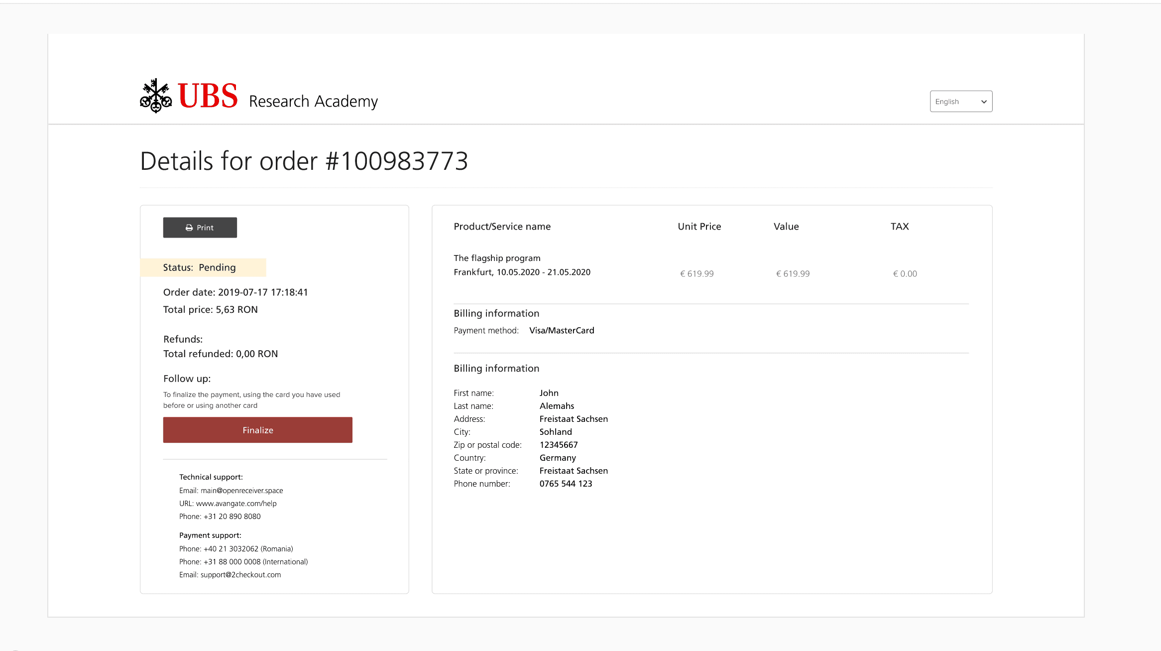
Example of Client implementation of the new My Account platform redesign:
Impact & Results
Post-implementation, we tracked the key performance indicators against the legacy baseline. The results confirmed that strategic UX is a direct revenue driver.
What changed when users could actually use it.
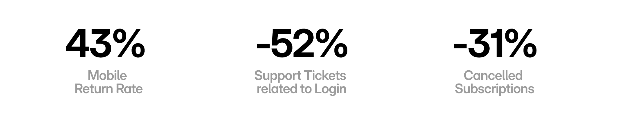
Reduced % of Support tickets Total | Reduced % of Support tickets for Login | Task Success Rate in User Testing | Dunning conversion |
|---|---|---|---|
⬇️ -18% | ⬇️ -52% | ✅ 88% | ⬆️ +23% |
Conclusions after this Platform Redesign:
Design as Revenue: In Fintech, UX is about reducing the "Distance to Transaction."
Systemic Thinking: A UI refresh is useless if the Information Architecture is broken.
Cross-functional Leadership: Success required deep alignment between Support, Product, and Engineering.
Other projects

AI-Powered Documentation Harmonization Tool for Standards Development
Designing an AI-powered auditing experience for high-stakes defense documentation.
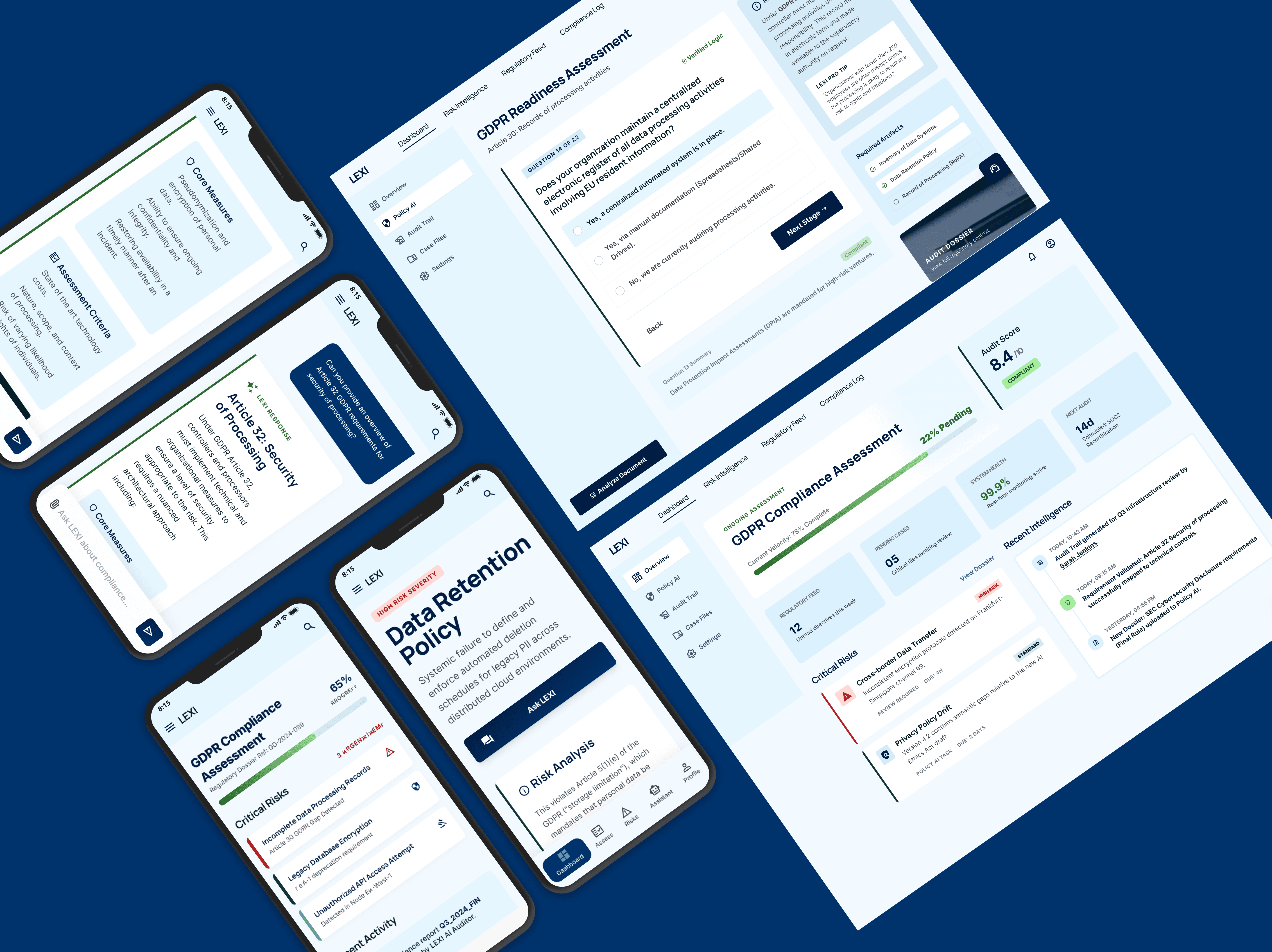
Lexi - the AI Compliance Assistant
Designing a decision support system in the form of a chat based AI application that helps non-legal teams navigate GDPR risk efficiently.