Faster documentation check.
Affiliate CPanel Redesign
Transforming a complex affiliate CPanel into a streamlined, high-performing workspace.
Role
Product UX/UI Designer
Industry
E-commerce
Duration
2 months

Objectives
Elevate the User Experience: Streamline core navigation, resolve usability bottlenecks, and establish a modern, cohesive UI.
Scale Platform Functionality: Seamlessly integrate upcoming features without overloading the interface or increasing cognitive load.
Drive Business Value: Optimize critical affiliate workflows to boost user retention, engagement, and platform performance.
My Process
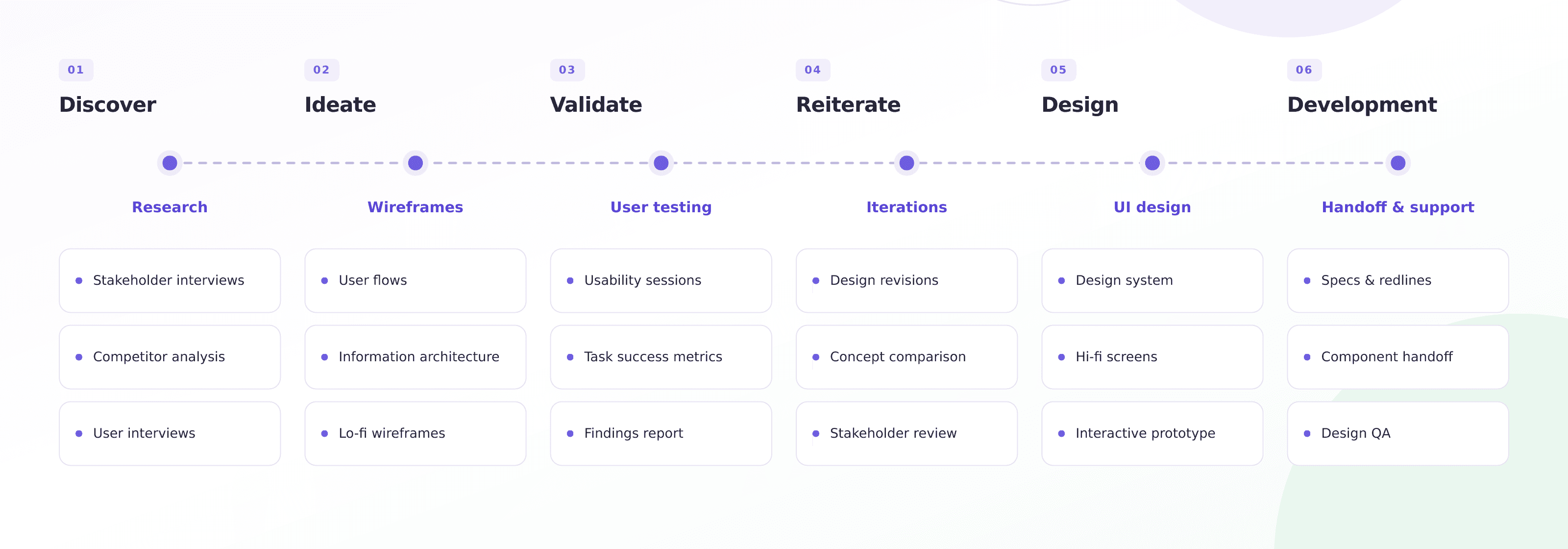
My process begins with deep research and inquiry, uncovering user pain points, analyzing behavioral data, and mapping out domain complexities to define the right problem to solve. From there, I translate raw insights into strategic artifacts like affinity maps and user journeys to align business goals with user needs. I then move rapidly into iterative visual exploration, creating wireframes, testing design concepts, and building scalable UI systems to ensure consistency. Finally, I refine high-fidelity interfaces and collaborate closely with cross-functional teams to deliver intuitive, high-impact products backed by clear validation.
Research Objectives
Uncover Core Usage Patterns: Deep-dive into platform workflows to understand how affiliates interact with key features daily.
Identify Usability Friction: Gather qualitative user feedback to pinpoint UI bottlenecks, pain points, and task failures.
Benchmark Competitors: Analyze market solutions to establish usability standards and identify opportunities for differentiation.
Key Research Questions | Rsearch Findings |
|---|---|
Activation Drop-off: Why are 13.5% of newly registered users failing to activate their accounts? | Insight: Onboarding lacked clear guidance and required too many manual setup steps upfront |
Information Relevance: Is the on-screen data surfacing the right insights at the right time to support decision-making? | Insight: Critical earnings and analytics metrics were buried 2 levels deep in the navigation. |
Task Friction: Which critical workflows are causing the highest rate of user error or frustration? | Insight: Generating affiliate tracking links took an average of 4 redundant clicks. |
Competitor Analysis
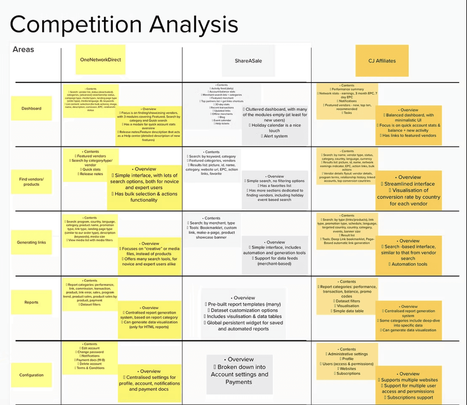
We assessed three main competitors in the market, looking at their platform's features and functionality. The key features identified helped us define better what could be missing and what to improve in the redesign:
Focus is on Vendor search or showcase
Large media (“creative”) pool, including different sizes, languages, types etc. Simple to use tool for generating reports, which include data visualization
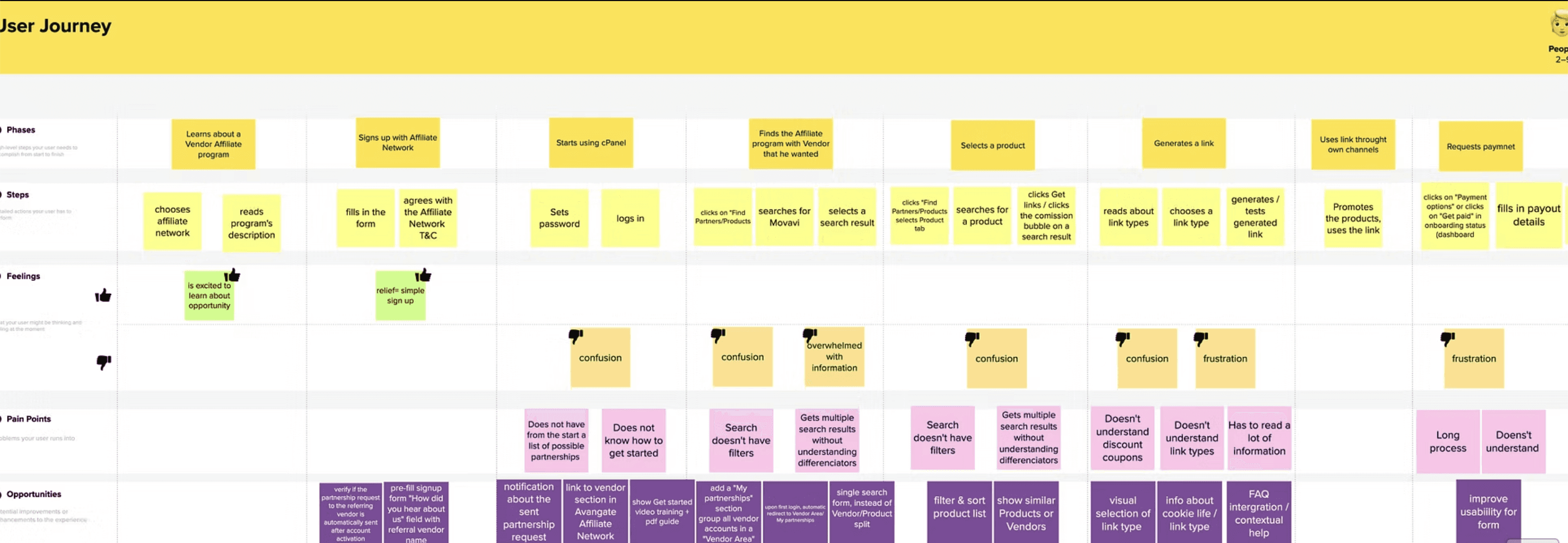
User Journey mapping
User interviews
Interviews: 8 participants (6 experienced users, 2 new sign-ups).
Key findings:
It was hard to find a vendor in the platform because multiple vendors with same name come up in search results x 2
It was hard to find a product in the platform because of, but not limited to:
clutter(test accounts, dev accounts),
lack of product/vendor description indexing,
products with no clear naming
More than 1 product with the same name but different commission
Test products
Session time is perceived at too short: after 1 minute of inactivity users are logged out
Affiliates do not understand the difference between link types.
They do not understand how cookie life varies between link types.
Some affiliates mentioned issues using the discount codes when products from more than 1 vendor are added to the cart (commission is either not given at all or applies only to 1 product).
They do not understand where the link type direct them.
Naming of link type is not always clear (e.g. "Add to shopping cart" - whose shopping cart: vendor, affiliate, 2checkout?)


Pinpointing Areas of Opportuinities
After gathering the data, we defined the 3 essential areas that we needed to improve:
The Onboarding process- showing video tutorials, changing the dashboard, showing a progress map for new user that needed to complete a full flow to get started
The Generate Links area- users needed to get fast access to the platform's basic product, which is the link they use to monetize
The Search and listing of Products and vendors- users needed a fast and simple way to find what partnerships they were looking for.
Design Decision I took that proved to directly improve the UX of the application:
Feature | Problem Solved | Design Solution |
|---|---|---|
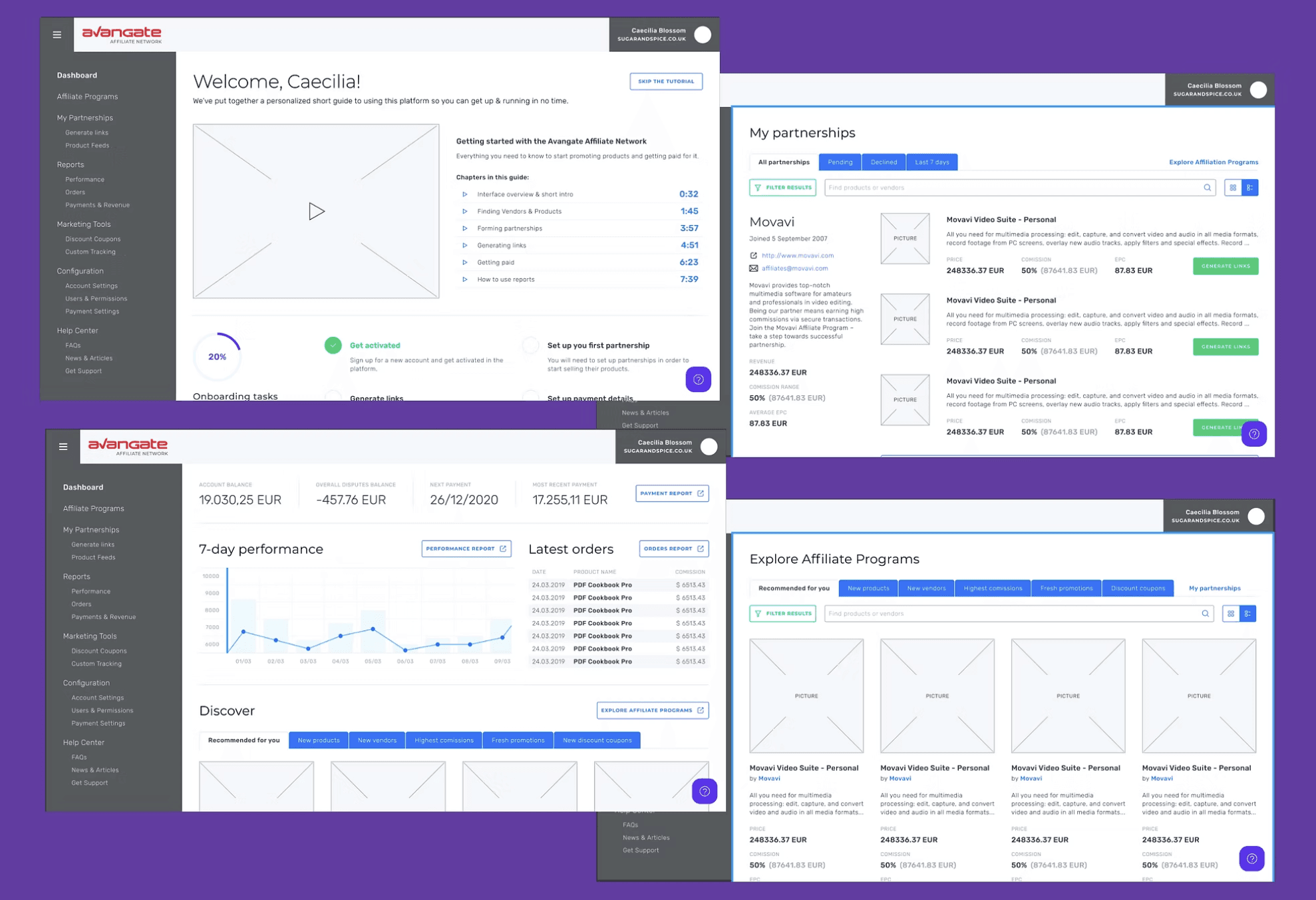
Guided Progress Tracker | Low onboarding completion rates. | A step-by-step progress checklist showing actions required to complete account setup and get paid |
Smart Search & Filters | Cluttered, duplicated product results. | Advanced filtering by commission rate, cookie life, and average payout, plus categorical tags for "Related Products." |
Streamlined Link Generator | Confusion around link types and parameters. | Pre-selected standard defaults based on historical data analysis showing the highest conversion rates. |
Simplified KYC Form | High friction during verification. | Restructured the "Know Your Client" form with intuitive document upload components and real-time status indicators. |
Contextual Dashboards | Empty/confusing landing experience for new users. | Dynamic empty states automatically redirecting users to relevant vendor partnerships or recommended affiliate programs. |
User Testing
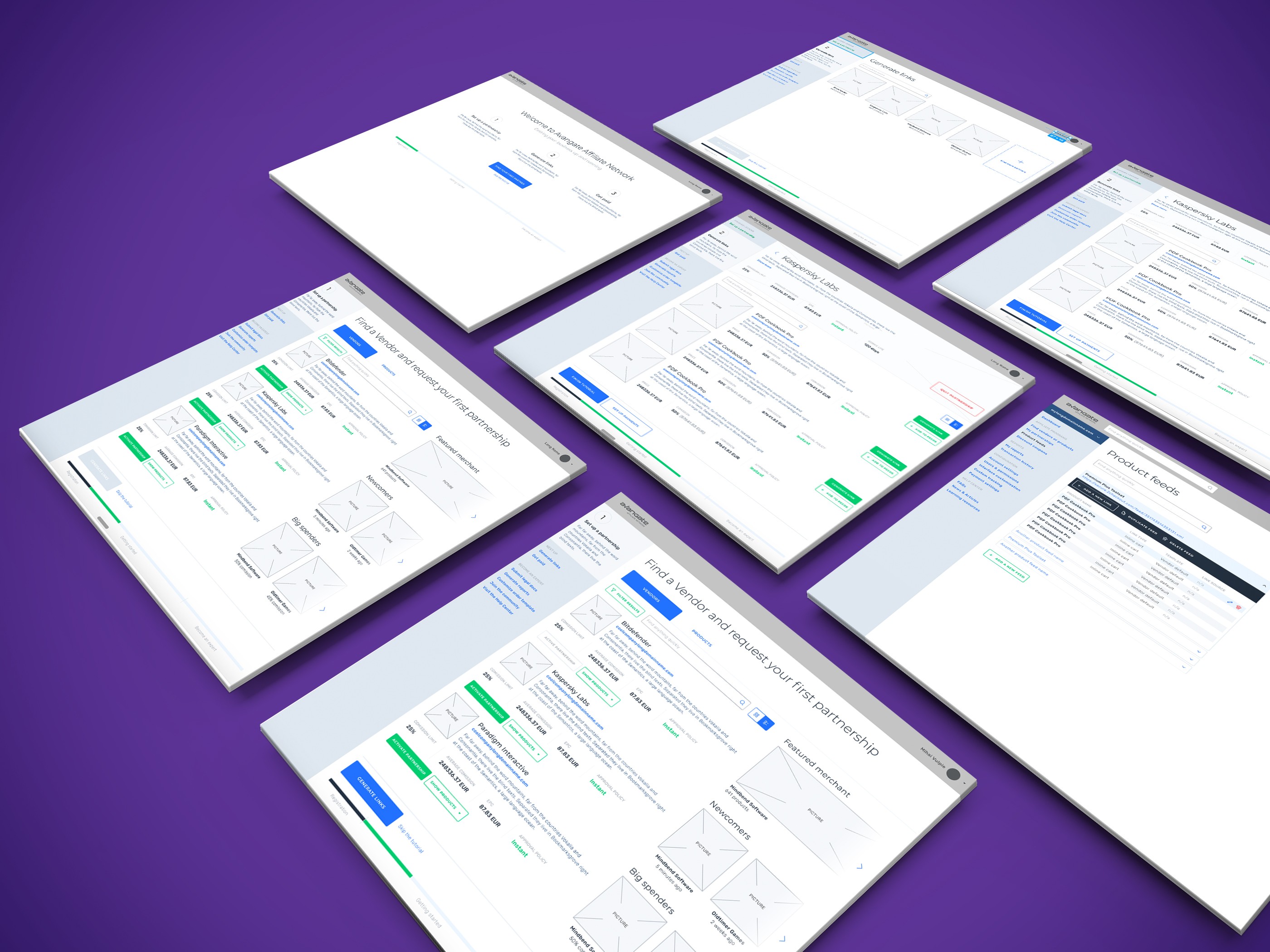
In order to reach the goals of the redesign after articulating all problems, I designed the mid-fidelity wireframes above used in user testing with the main features to be added and areas to be improved.
5 Users participated to the moderated usability testing and they were asked to complete the following tasks:
Find a vendor that you want to promote
Chose a product you want to promote
Generate a link for promoting it on your channels
Key Outcomes & Iterations:
Success: All 5 participants successfully completed the core tasks.
Feedback Integrated: Refined terminology around link parameters, enhanced visual hierarchy in the side navigation, and improved contrast across data tables for the final UI style guide and high-fidelity prototype.
Impact & Success Metrics
To validate the success of the redesign, we tracked key performance indicators (KPIs) post-launch:
Activation Rate: Reduced onboarding completion time and lowered the initial 13.5% non-activation rate.
Task Efficiency: Reduced average task completion time by an estimated 70–80% during usability testing, bringing search and link generation down from several minutes to nearly instant.Observed through various user testings. T
User Engagement: Increase in monthly logins and active session length (following the fix to aggressive session timeouts).
Stakeholder Feedback: Received positive feedback from both the internal Affiliate Management Team and external vendors regarding platform modernization.
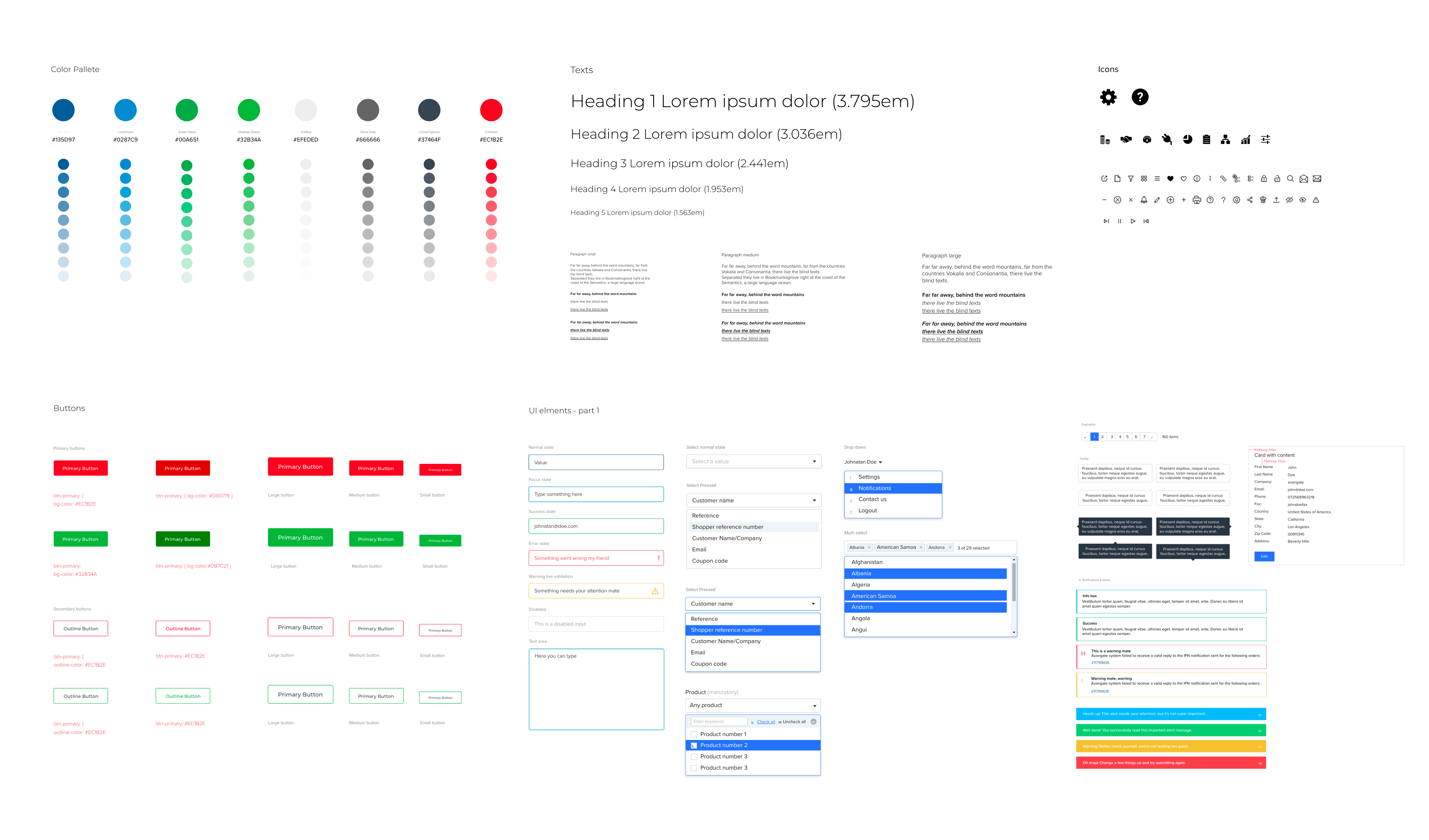
UI Style Guide
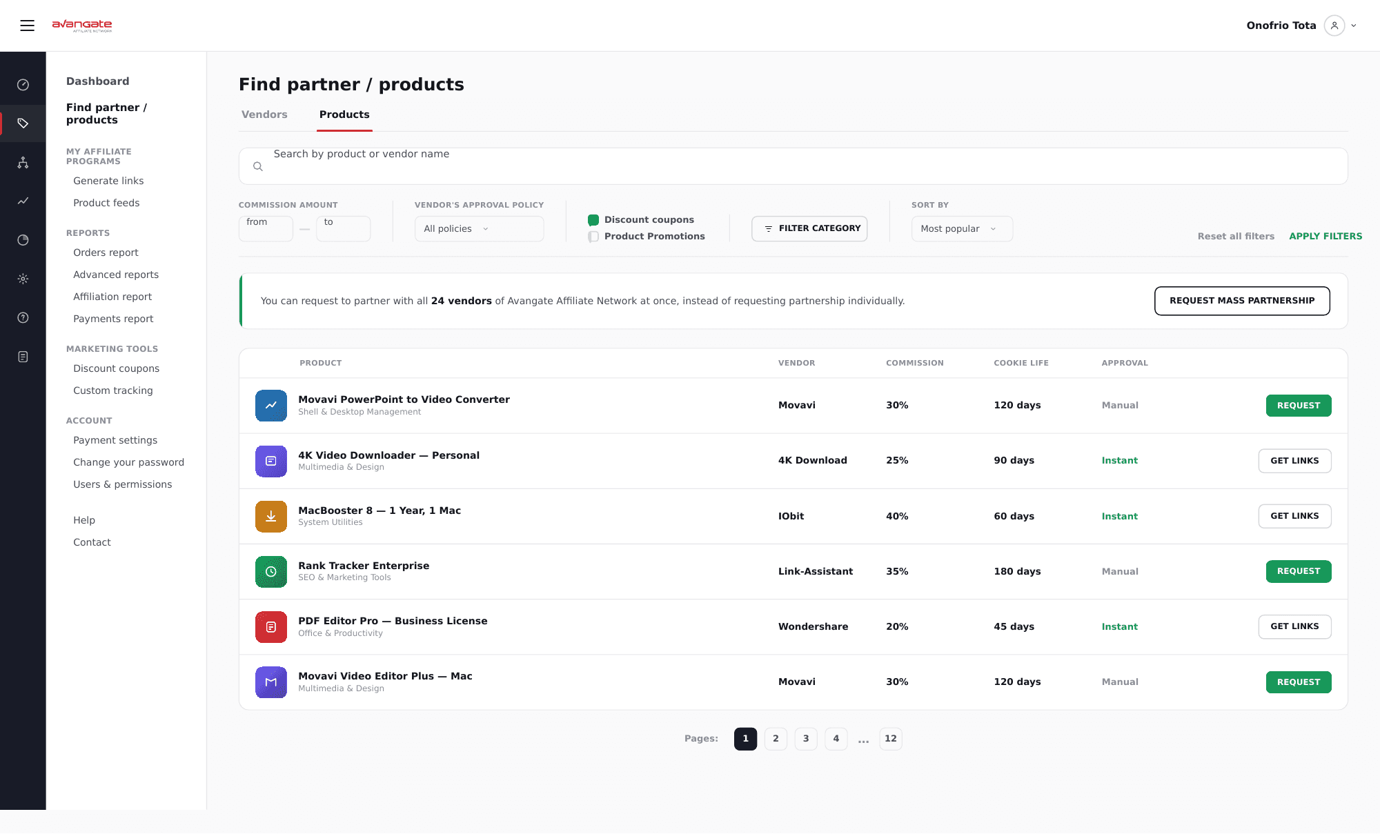
Design & Prototype
You can see more of this project here.
Key Takeaways & Reflection
Cross-Functional Alignment: The primary challenge was deciphering complex legacy features across multiple departments. Close collaboration with engineering and product management was essential to defining technical constraints early.
The Power of Focused Feedback: Users were highly eager to participate in redesign conversations when asked targeted questions about their specific workflow blockers.

Other projects

AI-Powered Documentation Harmonization Tool for Standards Development
Designing an AI-powered auditing experience for high-stakes defense documentation.

Lexi - the AI Compliance Assistant
Designing a decision support system in the form of a chat based AI application that helps non-legal teams navigate GDPR risk efficiently.
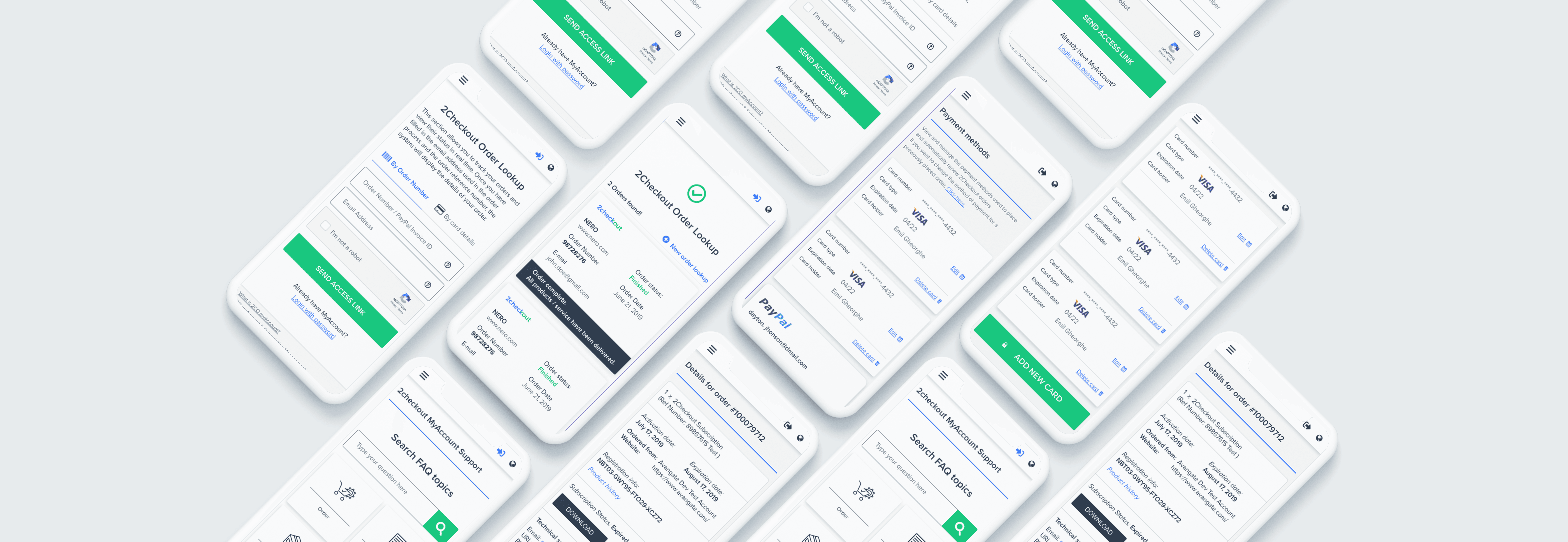
A Strategic Redesign of the MyAccount Shopper Platform
Transforming a legacy shopper portal into a streamlined self-service hub that reduces support overhead and empowers global users.