
Affiliate CPanel is the platform dedicated to managing affiliates network, enabling an affiliate user to create partnerships with vendors, generate links and sales and manage data and reports.
Context
Affiliate CPanel is a platform dedicated to managing affiliates network.
The scope of the redesign project was to bring the platform up to date with current UX and emerging usability needs and refresh the outdated UI.
Team
I worked along another UX Designer, working closely in a team with Product Manager, Product Owner and Engineering Team.

Objectives
Project objectives were defined together with Business Stakeholders, around the refresh of the visual interface and simplifying the flows and actions that led the users to find ease of use in their daily activity with the platform.
One main project objective was facilitating an easy flowing on-boarding process.

Research plan
Discovery
Phase
Research objectives
-
A better understanding of the platform’s specifics and the way it is used
-
Insights from real users about usability isuues and challenges they faced in using it
-
Analyze the competitive landscape
Main questions
-
What is stopping 13,5% of users that sign-up on the platform activate their accounts?
-
Is the information on the platform relevant?
-
What actions are proving to be difficult for users?
Competitor Analysis
We assessed three main competitors in the market, looking at their platform's features and functionality. The key features identified helped us define better what could be missing and what to improve in the redesign:
• Focus is on Vendor search or showcase
• Large media (“creative”) pool, including different sizes, languages, types etc.
• Simple to use tool for generating reports, which include data visualization

User interviews
Interviews: 8 participants (6 experienced users, 2 new sign-ups).

Key findings:
-
It is hard to find a vendor in the platform because multiple vendors with same name come up in search results x 2
-
It is hard to find a product in the platform because of, but not limited to:
-
clutter(test accounts, dev accounts),
-
lack of product/vendor description indexing,
-
products with no clear naming
-
More than 1 product with the same name but different commission
-
Test products
-
-
Session time is perceived at too short: after 1 minute of inactivity users are logged out
-
Affiliates do not understand the difference between link types.
-
They do not understand how cookie life varies between link types.
-
Some affiliates mentioned issues using the discount codes when products from more than 1 vendor are added to the cart (commission is either not given at all or applies only to 1 product).
-
-
They do not understand where the link type direct them.
-
Naming of link type is not always clear (e.g. "Add to shopping cart" - whose shopping cart: vendor, affiliate, 2checkout?)
-
User Journey Mapping

Pinpointing areas of opportunity
The Opportunities
After gathering the data, we defined the 3 essential areas that we needed to improve:
-
The Onboarding process- showing video tutorials, changing the dashboard, showing a progress map for new user that needed to complete a full flow to get started
-
The Generate Links area- users needed to get fast access to the platform's basic product, which is the link they use to monetize
-
The Search and listing of Products and vendors- users needed a fast and simple way to find what partnerships they were looking for.

Design Decisions
In order to reach the goals of the redesign after articulating all problems, we mapped the main features to be added and areas to be improved:
-
Progress Tracker showing the steps the user needs to complete in order to finalize a flow and get paid.
-
Generate links section simplified to a preselected option type of link that proved to be the most used in Data Analysis and had the best CR.
-
Introduce product categories for exploring "Related" products
-
Know your client section simplified and improved form and upload of documents.
-
Search section with efficient filters and sorting, defining what users needed to sort listing by and find relevant results: commissions percentage, cookie life, average commission.
-
Empty states upon first login, automatic redirect to Vendor Area/My partnerships
-
Automatically display links to vendor's affiliate program websites on dashboard for users that have a vendor recommendation to join platform.
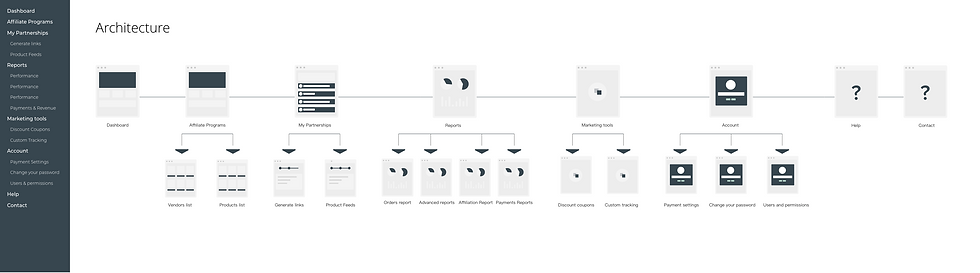
Architecture
What was my process?

Mid-fidelity wireframes

User Testing

User testing was done in order to establish if the core improvements and features were easy to use.
5 Users participated to the moderated usability testing and they were asked to complete the following tasks:
-
Find a vendor that you want to promote
-
Chose a product you want to promote
-
Generate a link for promoting it on your channels
Most users completed the tasks successfully, but there was valuable feedback that came out of this sessions and integrated in the following iteration of wireframes and prototype design.

Second
iteration
wireframes
UI style guide

Design


Conclusions
Prototype
You can see more of this project here.
Success metrics
-
Onboarding time
-
Affiliate Management Team feedback
-
Vendor feedback on affiliate portal look and feel & affiliate experience
-
Logins per month
-
Time spent on site
The project was a challenge because of the complexity of the platform, of the features that evolved over time and understanding all the functionalities. There was a big challenge in collecting all the information across the departments involved. It was a team effort and I think the best outcome of this project was the way collaborative work that was done.
Another important key takeaway is the involvement and easily given feedback when asked the right way and the interest of users in a redesign project that they see beneficial.